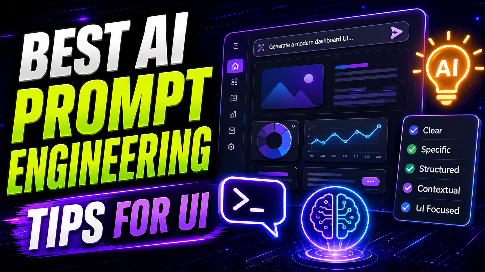
Designing user interfaces with artificial intelligence is incredibly challenging. Most creators treat UI generation like standard digital art. They type generic keywords and hope for a beautiful layout. This approach fails completely for professional web design. You cannot simply ask an AI for a “cool website.” You must learn the Best AI Prompt Engineering Tips for UI to succeed. Standard diffusion models naturally add heavy artistic flair. They invent complex shadows, photorealistic textures, and chaotic layouts. Modern UI requires the exact opposite. It demands clean lines, perfect grid alignment, and flat colors. To achieve this, you must control the mathematical engine directly. You must write prompts like a technical design brief. This comprehensive guide breaks down the exact frameworks you need. You will learn how to generate production-ready interface layouts locally.
The Core Structure of a UI Prompt
Your text prompt must be highly structured. A good prompt usually has five parts. These core parts are clarity, context, specificity, tone, and format. You should never write a bad, vague prompt like “make a landing page”. Instead, write a better prompt like “create a landing page wireframe for a coffee subscription service”. This specific context gives the mathematical model a clear structural goal.
A good prompt provides complete clarity on the project parameters. Bad prompts say things like “Write a headline for homepage”. Better prompts say “Write a headline for the homepage of a finance app targeting freelancers”. You should always define the role, context, and instruction. Start by assigning the AI a specific professional role. Tell the software, “You are a senior UX strategist”. Then, define the core subject, medium, and artistic style. The subject is your main core idea. The medium could be a flat vector illustration. The artistic style dictates the final aesthetic polish. Structuring your text this way eliminates mathematical ambiguity entirely.
Using Weight Adjustments for UI Elements
Sometimes, the AI ignores a critical part of your prompt. You might request a specific primary color, but the AI completely forgets it. You can fix this by using mathematical weight adjustments. Placing words into parentheses alters their impact on the prompt.
For example, typing (blue buttons:1.3) forces the AI to pay attention. The number after the colon represents the exact importance of the keyword. A value above 1.0 increases the emphasis. A value below 1.0 decreases the overall impact. This technique is absolutely essential for precise web design. You can heavily weight keywords like (flat design:1.4) or (clean grid:1.2). However, do not use insanely high weights. High weights like 1.4 or 1.5 may cause unwanted issues in the generated image. Keep your adjustments balanced and subtle.
Mastering Negative Prompts for Clean Design
Positive prompts tell the engine what you want to see. Negative prompts convey what elements should be completely avoided in the generated image. In UI design, negative prompts are actually much more important than positive ones. Standard checkpoints naturally drift toward photorealism or complex 3D rendering.
You must aggressively filter out these unwanted artistic elements. Use negative prompts to prevent blurry or low-contrast images. Add terms like “3D render, complex shadows, photorealism, messy layout” to your negative box. The algorithm calculates the noise predicted by the positive prompt. Then, it subtracts the noise predicted with the negative prompt. This subtraction mechanism works effectively for stripping away unwanted artistic textures. It guarantees a clean, flat aesthetic perfect for modern web applications.
Design Experiences, Not Isolated Screens
Most beginners suffer from severe screen myopia. They generate a login screen and then stop. Then, they try to generate a dashboard on a separate canvas. The AI completely forgets the visual relationship between these two images. Users do not experience isolated screens. They experience continuous digital flows.
You must prompt for continuous journeys instead. This technique is commonly known as Flow Mode. You describe the entire multi-step process in one go. Tell the AI to “Create a mobile banking onboarding flow”. List out step 1 for phone number entry, step 2 for OTP, and step 3 for dashboard. You are not just generating static UI. You are actually orchestrating user behavior. This ensures consistent branding across all visible steps.
Sectional Editing and Iteration
The biggest mistake you can make is re-rolling a good design. If you love the hero section but hate the pricing table, do not click generate again. If your only option is to regenerate the screen, you are gambling. The entire page will regenerate, and your perfect hero section is ruined.
Professionals use non-destructive editing workflows instead. You must isolate sections and refine them independently. This is the core idea behind Sectional Editing. You select only the broken pricing table area using a mask. You write a new prompt: “Change this pricing section to three columns”. You tell it to highlight the middle plan as ‘Best Value’. The rest of the page stays completely intact. This drastically reduces the cost of iteration.
Utilizing LLMs to Enhance UI Prompts
Writing highly technical prompts manually can become exhausting over time. You can actually automate this process using large language models. You can use LLM models like LLaVa to improve your prompts. You connect these intelligent text models directly into your ComfyUI workspace.
You need a custom node called “ComfyUI_IF_AI” to achieve this. You can use Ollama to serve the LLM models locally. You type a very basic idea like “finance dashboard.” The LLM reads this and expands it into a massive, highly detailed technical brief. It adds the exact colors, layout structures, and spacing rules automatically. This automated expansion ensures you never face blank page syndrome again.
You can also use these models to brainstorm professional color palettes. You give the LLM specific instructions to follow. Tell it to suggest 5 colour palettes for a meditation app, each with 3 primary and 2 accent colours. You can also use LLMs to write onboarding copy for a fitness app in a friendly, supportive tone. Injecting contextual text into mockups makes them look much more professional than standard placeholder text.
Prompting for Scaffolding versus Final Assets
You must break your design process into specific logical phases. Do not ask for a fully polished, final website on your very first try. Phase 1 is always scaffolding. The main goal here is structure, not final visual polish.
You start with a raw intent, like a “Fintech SaaS dashboard”. You ask the AI to generate real layout containers. You want clear blocks for the hero, features, and pricing sections. This workflow kills blank page syndrome instantly. Once the wireframe scaffolding is approved, you move to Phase 2. You run the basic image through an image-to-image pipeline. You add specific color palettes and font styles during this second refinement pass.
Keeping Prompts Simple and Focused
While technical detail is important, overwhelming the AI is highly dangerous. Complexity in prompts can lead to conflicting terms. This conflict will severely affect the final image quality. Stable Diffusion struggles with generating images that respect contradicting prompts.
If you ask for a “minimalist layout” and “dense data tables” simultaneously, the AI breaks. Keep your core concepts highly focused and strictly aligned. Remember that prompt effectiveness varies with different checkpoints. A prompt that is highly effective with one checkpoint may yield poor results with another. Always test your text strings on a flat UI LoRA model first. Adjust the words based on how that specific model reacts to your instructions.
Addressing Tokenization Issues
Finally, you must understand how the AI engine reads your words. The software breaks your prompt text down into individual tokens. This tokenization process directly impacts the model’s interpretation. You must analyze these text tokens carefully to succeed.
By analyzing these tokens, you can identify potential issues. Sometimes, out-of-vocabulary words split into confusing sub-word tokens. Multi-word phrases might not tokenize together as you originally expected. Ambiguous tokens like “3D” could be interpreted in multiple conflicting ways. For instance, in the prompt “A realistic 3D render of a red apple,” the clarity of tokenization can significantly affect the quality of the output image. Treat your prompts like a form of strict programming language. Create a modular system that is very simple to adjust and extend.
Creating the Final Production Hand-Off
Generating a beautiful image is only half the battle. Here is the real test: Can this export to Figma with Auto Layout?. Can it generate clean HTML or React code?. Is the structure semantic and highly usable?.
If the answer is no, you are back to manual rebuilds. Production-ready output is non-negotiable for professional developers. You must prompt the AI to align elements strictly to a 12-column grid. You must instruct it to use distinct, easily sliceable asset layers. By mastering these strict Best AI Prompt Engineering Tips for UI, you bridge the gap perfectly. You turn random generative art into highly functional, production-ready digital products.